Scaffolding Design System Components Using Plop.js
On This Page:
A tenet of Design Systems is a commitment to consistency, from creating and maintaining design tokens to standardising components and establishing uniform design patterns.
Creating a consistent folder structure with standardised files reinforces this principle, helping developers easily locate component files and understand their purpose. This repeatable structure reduces confusion, minimises onboarding time, and ensures that every component aligns with the system’s overall organisation and coding standards.
In this post, we’ll explore how to use plop.js to automate the creation of these files and folders, ensuring every component follows a consistent structure. We will walk through setting up plop.js, configuring templates, and creating prompts to streamline your workflow and keep your Design System and its components organised.
What is plop.js?
Plop.js is an open-source tool for automating file and folder creation, allowing us to generate consistent component structures with ease. By setting up templates and prompts, we can use plop.js to scaffold the necessary files for a component, ensuring everything follows our defined structure.
In this post, we will configure plop.js to generate the exact files and folders needed, making it simple to maintain consistency across all new components.
Setting up plop.js
To get us started, I have created a new git repository which will have the finished code in.
Let's begin by setting up the project with plop.js. After setting up the folder using npm init we need to install plop.js as a dependency
Now create a configuration file plopfile.js that will be used to generate a component folder and files.
To start we need to add the basic configuration my importing plop
module.exports = (plop) => {
  // This is where we’ll define our component generator
};
We can then define our generator. To start with we can give the generator a description, this is a helpful label especially if you plan to create several generators. If a user runs plop without specifying a generator it will display a list of generators available with these descriptions which can help the user understand the purpose of each option.
module.exports = (plop) => {
  plop.setGenerator('component', {
    description: 'Create a new component with files and folders',
  // more code
As we are creating a generator for components we would need to ask the user the component name so it can generator appropriate files and folders with that name as needed:
module.exports = (plop) => {
  plop.setGenerator('component', {
    description: 'Create a new component with files and folders',
    prompts: [
      {
        type: 'input',
        name: 'name',
        message: 'Component name?',
      },
    ],
  // more code
To start with let's generate an .njk, .scss, and .js file for the component. We can give the .njk file the component name that is inputted, the .scss and .js files will be both have the name of index so importing it simpler.
For plop to create files we need to give the plopfile.js some actions, for this we are adding files so we use the type of add:
module.exports = (plop) => {
  plop.setGenerator('component', {
    description: 'Create a new component with files and folders',
    prompts: [
      {
        type: 'input',
        name: 'name',
        message: 'Component name?',
      },
    ],
    actions: [
      {
        type: 'add',
        path: 'src/components/{{pascalCase name}}/{{pascalCase name}}.njk'
      },
      {
        type: 'add',
        path: 'src/components/{{pascalCase name}}/index.scss'
      },
      {
        type: 'add',
        path: 'src/components/{{pascalCase name}}/index.js'
      },
    ],
  });
};
Let's Generate
With a basic set of actions to create files in a folder we can start to use plop to scaffold new components. With the dependency installed we can add a build script to the package.json:
We can now run npm run build on the command line. This will give us a prompt:
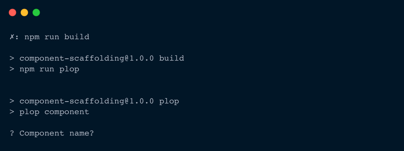
Giving the prompt a name and hitting return will generate the three files in a folder
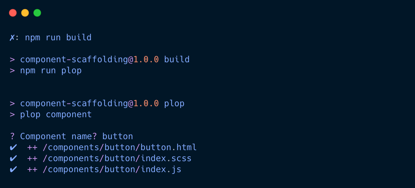
note: You can see in the path we have {{pascalCase name}}. pascalCase is here if you give the prompt more than one word for your component. I'm going to change this to kebabCase for the rest of this article.
Using Templates
Each file generated using plop can have a associated Handlebars template file, ensuring consistent, structured content is created automatically during the plop process.
Let's say we want to have something like this in your generated Nunjucks and Sass files:
We can create a new .hbs file for each of these and add the content needed so plop can generate them.
// template/component.njk.hbs

<div class="{{kebabCase name}}">

</div>
// template/index.scss.hbs

@use 'config/variables' as *;

.{{kebabCase name}} {

}
We can reference these files in plopfile.js using templateFile:
module.exports = (plop) => {
  plop.setGenerator('component', {
    description: 'Create a new component with HTML and SCSS files',
    prompts: [
      {
        type: 'input',
        name: 'name',
        message: 'Component name?',
      },
    ],
    actions: [
      {
        type: 'add',
        path: 'components/{{kebabCase name}}/{{kebabCase name}}.njk',
        templateFile: 'plop-templates/component.njk.hbs',
      },
      {
        type: 'add',
        path: 'components/{{kebabCase name}}/index.scss',
        templateFile: 'plop-templates/index.scss.hbs',
      },
      {
        type: 'add',
        path: 'src/components/{{pascalCase name}}/index.js',
      },
    ],
  });
};
Everything is a component
When architecting the structure and naming conventions for your components you may find it easier to separate 'types of component' into separate folders. For example, if you use the ideas around Atomic Design and want to follow the structure for your components as atoms, molecules, and organisms you may want to split out these types of components.
We can do this by adding a further prompt that can add a namespace to the component as well as put these components in the correct folder.
Adding another prompt that is a list will give the user only one option to pick which will aid consistency. Rather than requiring them to spell the type of token correctly or remember the name-spacing we can get the information from this prompt and generate the components folder and file structure accordingly.
Let's add a new prompt
{
  type: 'list',
  name: 'type',
  message: 'Is this component an atom, molecule, or organism?',
  choices: ['atom', 'molecule', 'organism'],
},
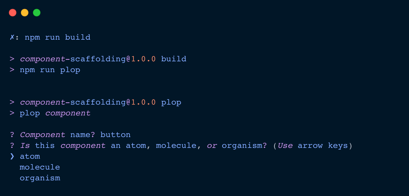
We still need to update the paths and any templates to make use of this prompt. The prompt gives us the {{type}} which takes the response from the choices in the prompt.
actions: [
  {
 type: 'add',
 path: 'components/{{type}}/{{type}}-{{kebabCase name}}/{{type}}-{{kebabCase name}}.njk',
 templateFile: 'plop-templates/component.njk.hbs',
  },
  {
 type: 'add',
 path: 'components/{{type}}/{{type}}-{{kebabCase name}}/index.scss',
 templateFile: 'plop-templates/index.scss.hbs',
  },
  {
 type: 'add',
 path: 'components/{{type}}/{{type}}-{{kebabCase name}}/index.js',
  },
],
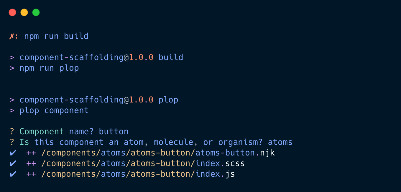
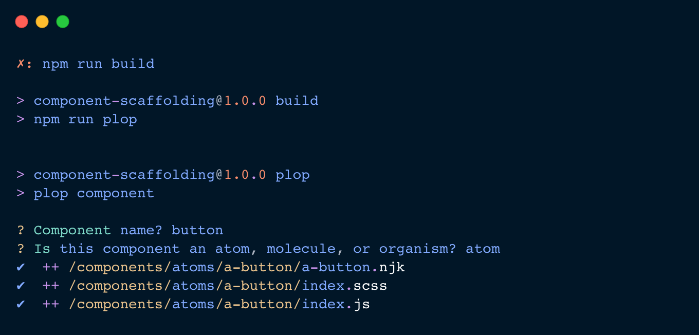
As you can see from the image we created a new component called atoms-button. The more mature your Design System becomes the more potential components you will had and may need to create. Rather than atoms-, molecules-, and organisms- as the name space, let's create a quick help that will abbreviate these to a-, m-, and o-.
// Custom helper to define type abbreviation
plop.setHelper('typeAbbreviation', (type) => {
  switch (type) {
    case 'atom': return 'a';
    case 'molecule': return 'm';
    case 'organism': return 'o';
    default: return '';
  }
});
We still need to update the templates for the .njk and .scss file. So let's update the plop-templates/component.njk.hbs and plop-templates/index.scss.hbs files to make use of the {{type}} too.
// template/component.njk.hbs

<div class="{{typeAbbreviation type}}-{{kebabCase name}}">

</div>
// template/index.scss.hbs

@use 'config/variables' as *;

.{{typeAbbreviation type}}-{{kebabCase name}} {

}
What else to generate for a Design Systems component
No we have a basic component folder and file structure generator we can think of what else we might need.
a read me file
{
  type: 'add',
  path: 'src/components/{{type}}s/{{typeAbbreviation type}}-{{kebabCase name}}/README.md',
  templateFile: 'plop-templates/README.md.hbs',
}
adding a creation date
Creating a new helper we can add a 'creation date' to files we need to:
plop.setHelper('creationDate', () => new Date().toLocaleDateString());
Which could be used in the README.md template:
{{typeAbbreviation type}}-{{kebabCase name}} Documentation

Created on: {{creationDate}}

---

## Usage

## Code Example

## Variants

## Props
By making use of plop.js we have automated a consistent structure for our component files, helping maintain organisation and clarity in our codebase. This initial setup can be easily adapted to your differing projects. You might consider adding test files, component design tokens .json, moving Sass into a separate folder. Adjusting plop.js to match your team's needs and workflow are simple with the flexibility it offers.
I hope this short tutorial has helped you think about a practical approach to enhancing your Design System's scalability and efficiency by automating a small part.