Design Tokens have landed in Penpot, kinda
On This Page:
At the end of last week I found myself spending the day at my partners antiques centre whilst they were away. It was quiet, not so many PPPs (pick up, put down, p*ss off) but a few SSSs (small significant sales).
I found myself sat on an old upholstered chair with my laptop and thought I’d have a go at creating a ‘design tokens starter’ for Penpot.
After working out how to create circles and text, group them, duplicate them and group them again I was already tired at how much work was involved (“this would be easier in code” I said to my-(front-end-developer)-self).
I then spotted it, the Design Tokens panel and shifted gears.
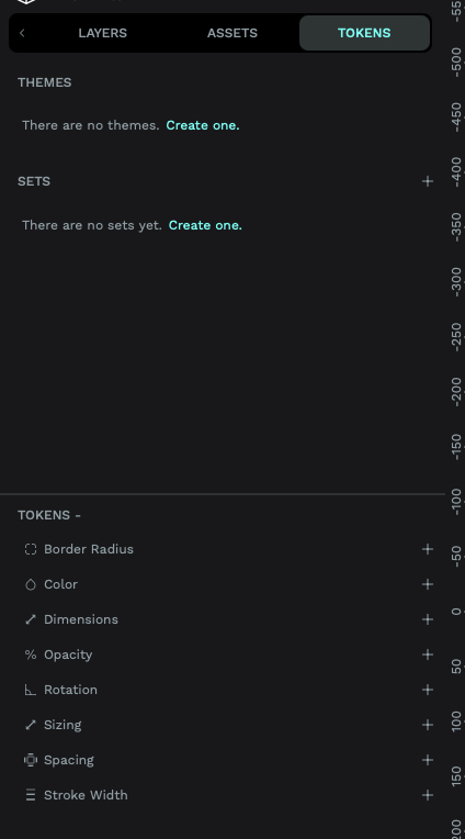
Nice, a way to create design tokens built into the UI, including themes, sets and the tokens themselves.
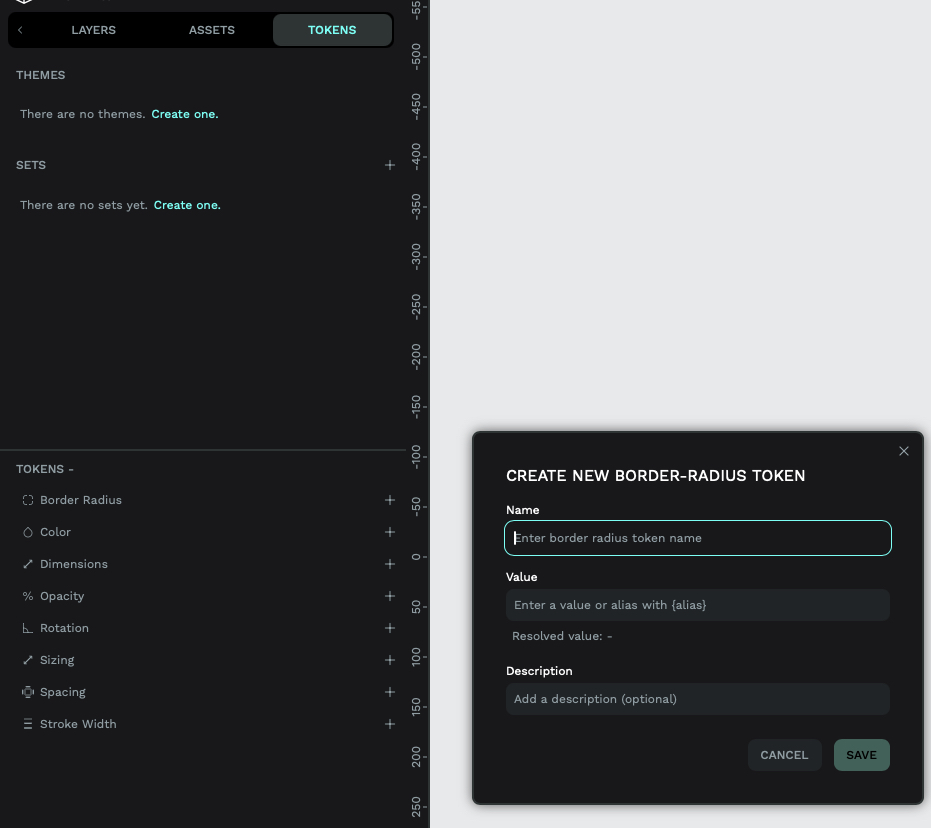
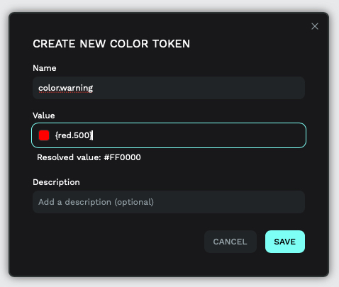
I clicked the little plus icon next to border-radius and was given a popup to add a new token.
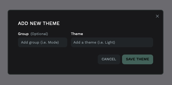
Adding a new theme also had a similar pop up:
Adding a new set gave me something a little different:
At the bottom of this side panel had another button that was labelled ‘tools’. I clicked it, who doesn’t click a new button.
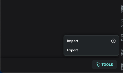
Ooh, an “import” and an “export” option. “Ok, let’s look for some documentation on this.” I thought and went to my favourite browser of choice and started searcing.
To The Documentation!
I found documentation explaining this panel (and a bit more) on their site.
It’s using the W3C Design Tokens Community Group Draft Format, it shows how you can reference tokens, what tokens you can create, edit, and use. It also introduces “Token Sets” (layers, or teirs pehaps) and “Token Themes”.
Tokens
Creating a token using the UI allows you to add:
- name: what you are naming the token (unsurprisingly). Be it
spacing.100orpage.background.coloretc. - value: depening on what type of token you’re creating you can apply a number or something from the available colour spaces (Hex, RGB, RGBA, ARGB, HSL or HSLA).
- description: the ability to add something meaningful to what the token does, is, or it’s intention.
The available tokens (so far) are:
- color
- dimensions
- sizing
- spacing
- border radius
- opacity
- rotation
(sadly, at the time of writing this, anything for typography seems to be missing. This new Design Tokens implementation is brand new so I hope we will see something coming soon). As this implementation is making use of the specification you can also reference other tokens:
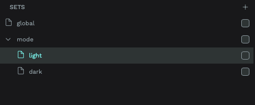
Token Sets
This option gives you the ability to have defined layers (teirs) of your Design Tokens. So you can group related tokens into an easy ‘turn off and on-able’ set. You can also group token sets into a visual ‘folder’ in the UI:
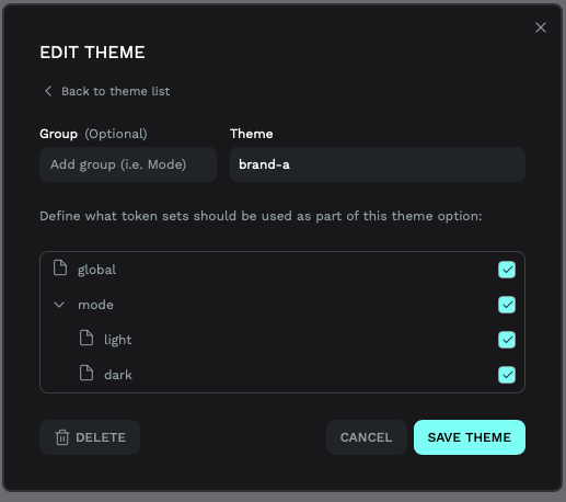
Token Themes
Themes allow you to group your token sets for a specific context, like a unique brand or theme. Again you can also group your themes like you can with token sets. You can also apply the same token sets to multiple themes - which would be great for a multi-brand system that has similar base layer tokens. You can define all of this in the edit theme popup:
Creating a quick example
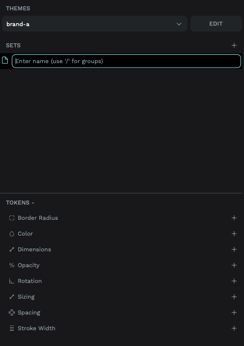
I quickly popped in some tokens, added some themes and sets and came to a UI panel like this:
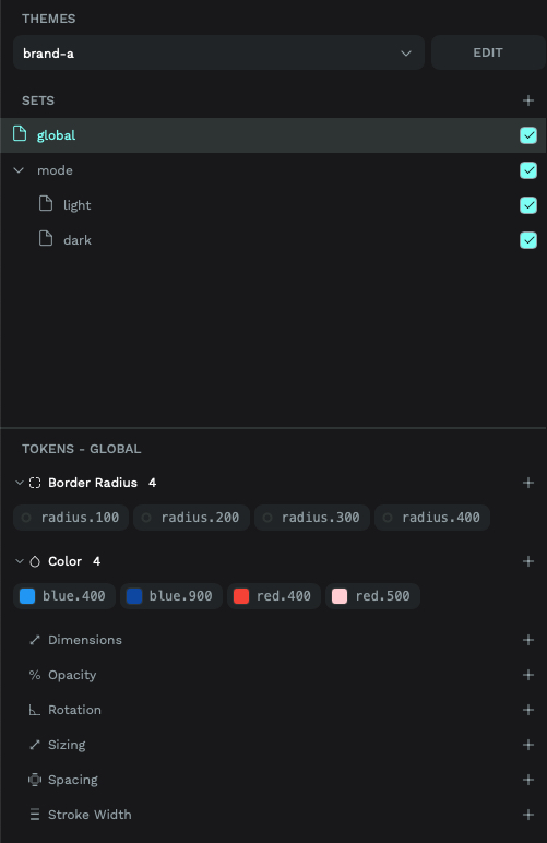
We have ‘brand-a’ as the active theme, we have the global and both mode token sets active and we seeing the tokens that are part of the global set at the bottom of the UI.
But, as a developer…
This all looked pretty cool, as a front-end developer I wanted to know more about the importing and exporting of data.
As I’d already created a few tokens in the app, the best way to see how you can import a .json file was to export what I had.
So we get the code interpretation of the tokens I added, following the DTCGs specification using $value, $type, and $description and we also get some other information.
The themes seem to have some propietary .json for the application, but it shows us:
- What themes are available
- What Token Sets each theme uses
Below the themes we also get some more propietary .json. This $metadata looks like it helps the Penpot UI turn on (or off) whatever token theme and it’s token sets are active.
A Quick Wrap Up, Before Part Two
Penpot’s Design Tokens implementation marks a promising but (at the moment) incomplete step forward. While the tool now supports W3C DTCG-compliant tokens – enabling themes, token sets, and cross-referencing – gaps remain.
The absence of typography tokens (font families, weights, line heights) undermines its utility for holistic design systems (but this feature is a week old, let’s give it some time).
Creating tokens manually in the UI also feels laborious (to me) compared to code-driven workflows, and proprietary metadata fields like $themes can risk vendor lock-in.
In “Part Two”, I will look at using Style Dictionary to generate a format that Penpot can use and (hopefully) see how we could use Penpots exported .json as a source of truth too (if needed).
I’m still in two minds at where I see Design Tokens (as a thing) being stored as a source of truth. The pendulum swings from code or design to it’s own place that design and code tools should import (but I guess that might be a article in itself).
An update
A day or two after publishing this, Xaviju reached out to update me on some of the points that I mentioend in the wrap up.
- They are "already working on composite tokens and typography is a top priority"
- "A code editor is on our roadmap" 👀
- They "are working to improve the current DTCG standard with themes" so the metadata could be improved to " provide a better experience"
I also noticed that, with Laura, Penpot have released a short video on using Design Tokens with Penpot.
