Creating Design System-Friendly Snowflakes with Utility Classes

Whilst I was helping EMBL in creating a new Design System based on a brand refresh and website re-organisation (going from 7 individual websites to one) we got to a point where other teams started to require unique components or patterns that would not necessarily fit into the larger Design System (The Visual Framework) but still needed to be ‘of the Design System’.
Teams needed either completely new components or they wanted to enhance or change certain characteristics of existing components to fit their unique needs.
I came up with a pragmatic approach that would help teams make these components whilst not venturing far away from the overall design language of the Design System.
In generating CSS Utility Classes from the Design Tokens it gave teams that needed to sway from the Design System the ability to create unique components (snowflakes) that were of the Design System.
Snowflakes in Design Systems
A ’snowflake’ in a Design System is a one-off component that could be needed for a specific project, but there is an understanding that it may not be reused or may only be required by one team within an organisation.
These components could be problematic as part of a Design System as their intention is normally restricted to a specific use case for a certain team or brand.
They could potentially disrupt the overall Design System by creating the perception that it should include every component, even if a component is only intended for a specific part of a single page (or more). Instead, the Design System should primarily house components that are widely used, thoroughly tested, and essential across multiple areas.
To help teams still have some freedom in creating new components that they might need but it being something that may never end up in the Design System creating a solution like Design Token specific utility classes they can create these components with a level of confidence that it would match with the surrounding components from the Design System on the page.
When addressing the need for a team to create a unique, special, one-off snowflake I found that supplying utility classes based on the base layer and semantic layer of the Design Tokens allows them to create what they need without diverging from the look and feel of the Design System.
Utility Classes from Design Tokens
Utility classes can be seen as small, single-purpose CSS classes that apply specific styles directly to elements. Each utility class typically represents a single style rule or a small set of related styles, such as setting margin, padding, colour, font size, or alignment. For example:
.u-background-color--primarymight applybackground-color: green;.u-card-spacing--xlcould set padding to2rem.u-typography--buttonmight set the font family to a specific typeface for buttons
Utility classes can play a vital role in enhancing flexibility within a Design System by providing a simple, consistent way to apply styles directly in the HTML. This approach can help teams adapt and create custom components (snowflakes) without the need to write new CSS each time they encounter a unique design requirement.
By generating these utility classes from Design Tokens, teams can be confident that any custom components they create will still align with the overall visual language of the Design System.
Utility classes derived directly from the Design Tokens ensure that any changes made to the tokens will automatically propagate throughout the project. This means that if a token value is updated, such as adjusting a colour or changing a spacing scale, the utility classes will reflect these changes everywhere they are used, maintaining consistency across the system.
Creating a Snowflake Component
Although the Design System that I created with EMBL had several well thought out components that were readily available their came a point where one team needed something similar to the card component. From their user tested designs they needed some extra elements as well as some different spacing and sizing because of position of this card on the page.
At first they wanted a whole new component that would be part of the Design System but after some back-and-forth discussions it was agreed that they would take the existing card component and adapt it using utility classes. Again, this way they can be confident that their unique 'snowflake' component will match with the rest of the page.
I had some time on my hands that afternoon, so I decided to see how easily it would be to augment the existing component and what utility classes would be needed to match the design.

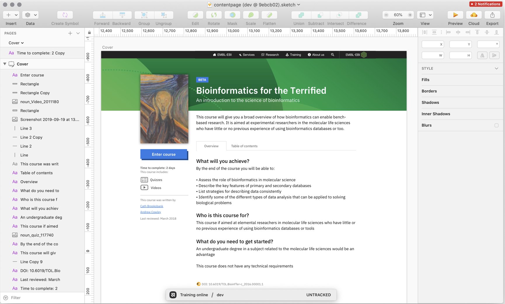
The Sketch file in the image above was what we were working towards. There are a few components that were part of the system that we could use, the figure component for the book cover image, the button for the, um, button. There was a couple of list items and the horizontal rule but there was also some typography and spacing treatment that was specific to this 'snowflake'.
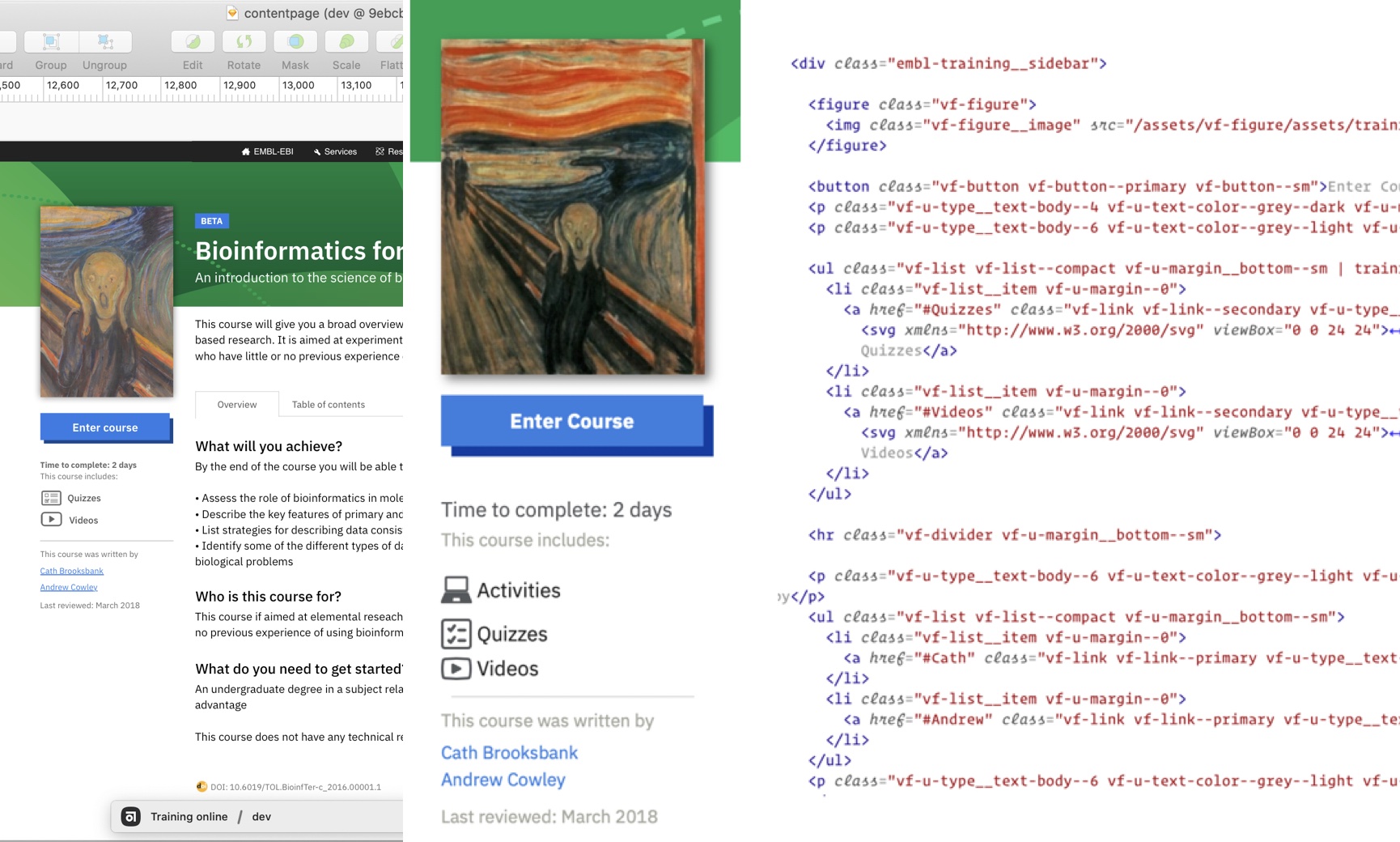
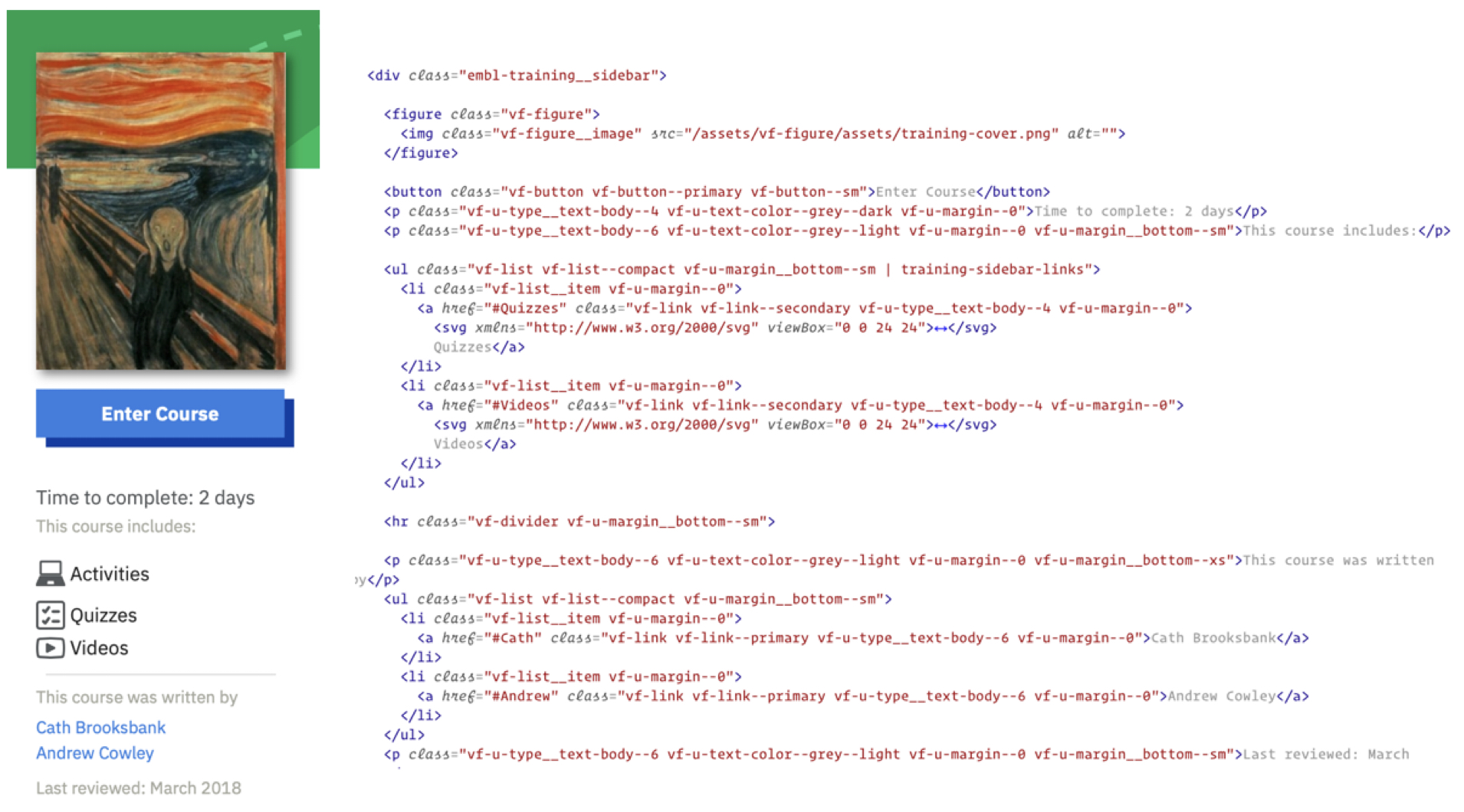
The image below shows this snowflake component next to the HTML that was written and adapted for it. There are additional CSS classes with vf-u- that denoted they were a utility class within the HTML.

Using utility classes along side or within existing components allowed the team to have their unique 'snowflake' component but making sure that the changes and additions applied still matched the overall Design System.
Balancing Consistency and Flexibility
Utility classes can provide a flexible and efficient solution for teams who need to create unique, project-specific components without straying from the core design language. By leveraging utility classes, we can avoid the pitfalls of adding variations and unique components as a permanent part of the Design System. Instead, teams could customise existing components to suit their needs, confident that their changes would still harmonise with the Design System.
This approach also means that any updates to the underlying Design Tokens could be automatically reflected in these custom components.
It can allow for greater adaptability across different projects ensuring that even when teams needed to step outside the core Design System, they were still operating ‘of the system.’
Ultimately, generating utility classes from Design Tokens provided the balance between consistency and flexibility, helping EMBL create a cohesive, scalable, and user-friendly Design System.